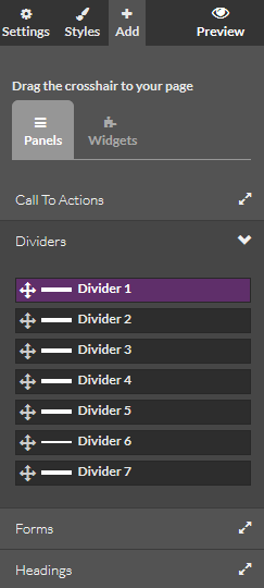
Brambl websites are made up of drag & droppable Panels.
A Panel is a full-width bar within which Blocks are placed. Blocks are then filled with pre-designed website content that can be changed to be relevant to your client.
In the Brambl editor, Panels are controlled and defined within purple lines while Blocks are within green lines.

To add a panel in Brambl, head to .
Select your preferred panel and drag it onto the page.


When you hover over a panel, you'll see options to customise it.
The first crosshair icon lets you move the position of the panel on your page. Hold it and drag your panel up or down the page.
The second copy icon lets you duplicate the panel. It will copy all the blocks and all the content, letting you customise again from a better starting place.
The third cog icon lets you configure the panel, more on this later.
The fourth x Panel option deletes the panel, along with all the blocks and content it contains.
The #2 tells you what order the panel is. This order can be used as an Anchor point in the text editor and menus.
Press the Panel cog icon and a right sidebar will appear specifically for this panel.
.png)
You can change the background colour, and even add a transparency. You can also add a background image. The Top layer image scrolls with the page while the Bottom layer image is static.
That means you can add a top layer with some transparency and a bottom layer as a background to create a great parallax effect.
Use Dimensions to define your Panel's max height and amount of padding.

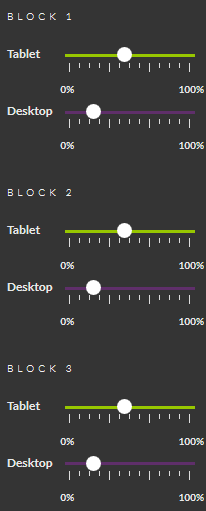
You can also set the Block Widths of each Block on both the Tablet or Desktop. By changing the sliders you can choose how much of the device width each Block should take up.

In the above example the 4 blocks within the panel will show in 4 columns for Desktop, and in 2 rows of 2 columns for Tablet.

There are also block specific options when you hover over them.
The first crosshairs icon lets you drag & drop your block within the Panel, and even onto another Panel.
The second magic wand icon lets you add custom animations, more on this later.
The third cog icon lets you adjust the padding or margin of your block to give it more or less whitespace.

You can also add a background colour or upload a background image

And you can choose to hide some blocks from Desktops, Mobiles or Tablets to create content specific to the device of your users.
The fourth copy icon lets you duplicate all the Block content and creates a new copy next to your original.
The fifth rubber icon strips out the Block content, but leaves a blank space in case you want a gap between two of your Blocks.
The sixth x icon deletes your Block and all the content inside it.
Press the second magic wand icon and an animate right sidebar will appear.

You can choose an effect to apply to this block, either after a few seconds when the user loads the page or by default when the user scrolls to the Block.
You'll see a preview of any affect you choose.
And you can choose how many times the animation happens and for how long the affect takes place.
Here's an example of 4 blocks with different animations when the user scrolls.

Brambl is built on the Bootstrap responsive framework, where we do background magic to ensure that panels/rows remain responsive. Panel/rows are made so they fit 12 "units" across thier width. So 4 equal blocks for example can be achieved with each block taking 12 divided by 4=3 units. Same for 3 equal blocks (12 divided by 3= 4 units each) and 2 blocks (6 units each).
This means that you can't make 5 block fit into a panel/row as 12 divided by 5 is not an integer.
Jump to contents page of
|
|||