Download our Digital Sticker Templates.
Take a look at our general guidelines for Supplying Digital artwork.
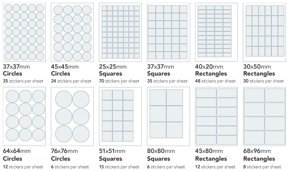
These are designed as sheets containing a grid of stickers. The area is yours to use, so you may place a different variation in each shape, or make them all identical.
Digital Stickers are delivered as A4 sticker sheets and the number of stickers per sheet depends on your chosen style.
We print the stickers on SRA3 sheets and then cut them in half prior to despatch.
The prices and quantities we display are for sheets of stickers. So if you choose a quantity of 20 for 37 mm Circles, then you will be ordering 700 stickers, as 20 × (A4 sheets having 35 stickers each).

View and compare all the options in the Digital Stickers product group:
| Product code | Product name | Printed |
|
FFKSC10 |
Digital Sticker Sheets: Circles 37mm | 35 per A4 sheet |
| FFKC45 | Digital Sticker Sheets: Circles 45mm | 24 per A4 sheet |
| FFKS2525 | Digital Sticker Sheets: Squares 25x25mm | 70 per A4 sheet |
|
FFKS3737 |
Digital Sticker Sheets: Squares 37x37mm |
35 per A4 sheet |
|
FFKR2040 |
Digital Sticker Sheets: Rectangles 20x40mm | 48 per A4 sheet |
|
FFKR3050 |
Digital Sticker Sheets: Rectangles 30x50mm | 30 per A4 sheet |
| FFKC64 | Digital Sticker Sheets: Circles 64mm | 12 per A4 sheet |
| FFKLC10 | Digital Sticker Sheets: Circles 76mm | 6 per A4 sheet |
| FFKS5151 | Digital Sticker Sheets: Squares 51x51mm | 15 per A4 sheet |
| FFKS8080 | Digital Sticker Sheets: Squares 80x80mm | 6 per A4 sheet |
| FFKSR10 | Digital Sticker Sheets: Rectangles 45x80mm | 12 per A4 sheet |
| FFKLR10 | Digital Sticker Sheets: Rectangles 68x96mm | 8 per A4 sheet |
Do not remove anything from (nor move anything on) the Finishing layer.
We have provided (invisible!) boxes on the Background layer, which you should use to contain your sticker backgrounds. If you have a uniform background, then it might be easier for you to use the larger box that encloses all shapes (also on the Background layer).
Jump to contents page of
|
|||